


Project Overview:
Under the patronage of the Government of Fujairah in the United Arab Emirates, the Arab Poetry Foundation is presented.
The Arab Poetry Foundation positions itself as a cultural beacon, revitalizing the significance of poetry in the Arab world. By blending tradition with innovation, it aims to be the contemporary custodian of poetic heritage, catering to both seasoned admirers and a new generation of poetry enthusiasts.
The purpose of the Arab Poetry Foundation is to be the nexus where the timeless beauty of poetry converges with the dynamic expressions of modern art. It aspires to inspire, educate, and create a space where poetry transcends its traditional boundaries, resonating with a global audience.
Logo Introduction:
APF Logo design is inspired by the ancient Hijazi inscriptions dating back to the 2nd and 3rd centuries AH (8th and 9th centuries CE), with borrowed elements from other Kufic styles in some details. The Hijazi inscription script belongs to the original family of pure Kufic scripts, characterized by immense strength and solidity, with a subtle elegance that enhances its brilliance and beauty. To align with the noble purpose of designing this logo, we have chosen to specifically employ this script style due to its powerful and beautiful letterforms that are fitting for conveying profound meanings, often illuminated in authentic Arabic poetry. Using this script in logos is a unique step that has never been taken before, given the ongoing work to extract its letters and make them available to the public.
APF Logo design is inspired by the ancient Hijazi inscriptions dating back to the 2nd and 3rd centuries AH (8th and 9th centuries CE), with borrowed elements from other Kufic styles in some details. The Hijazi inscription script belongs to the original family of pure Kufic scripts, characterized by immense strength and solidity, with a subtle elegance that enhances its brilliance and beauty. To align with the noble purpose of designing this logo, we have chosen to specifically employ this script style due to its powerful and beautiful letterforms that are fitting for conveying profound meanings, often illuminated in authentic Arabic poetry. Using this script in logos is a unique step that has never been taken before, given the ongoing work to extract its letters and make them available to the public.


Logo Details:
We have embraced the one-third proportion in the logo's design, creating a ratio where the negative space is a third of the mass. This approach serves to achieve a significant balance and aesthetic in the letterforms.
We standardized the shape and size of the "tarwissat" and "zulfa" in the letters to introduce harmony and visual comfort within the logo. In the horizontal logo version, we centered the letters "Alef" and "Lam" to establish a deliberate visual system, guiding the eye to the keyword, the most important and impactful element in the logo: "شعر".


Logo Icon:
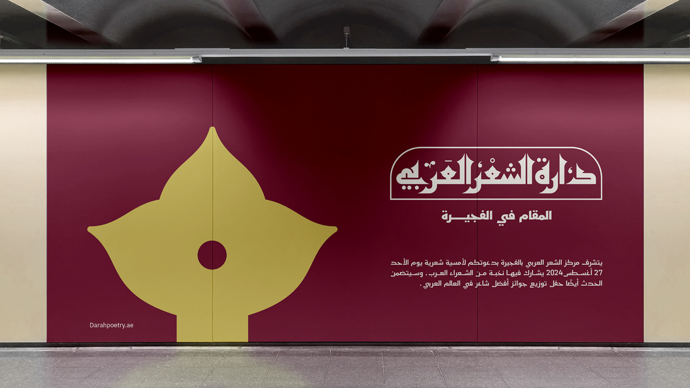
Our choice of the letter 'Ain' as the icon for the logo of the Arab Poetry Center in Fujairah is attributed to 'Kitab al-Ain' by Al-Khalil ibn Ahmad Al-Farahidi Al-Basri. He is a prominent scholar and a leader among Arab language and literature experts, credited as the founder of the science of prosody. This symbolism signifies the center's connection to the heritage and culture of the Arabic language, reinforcing its position as a hub for promoting poetry and literature. The form of this letter is inspired by the orchid flower, discovered in Wadi Al-Wurayah in Fujairah, the only place in the Emirates where this flower grows. The presence of this rare flower in this location epitomizes the center's uniqueness, reflecting the spirit of creativity, artistic diversity, and cultural richness.


Color Introduction:
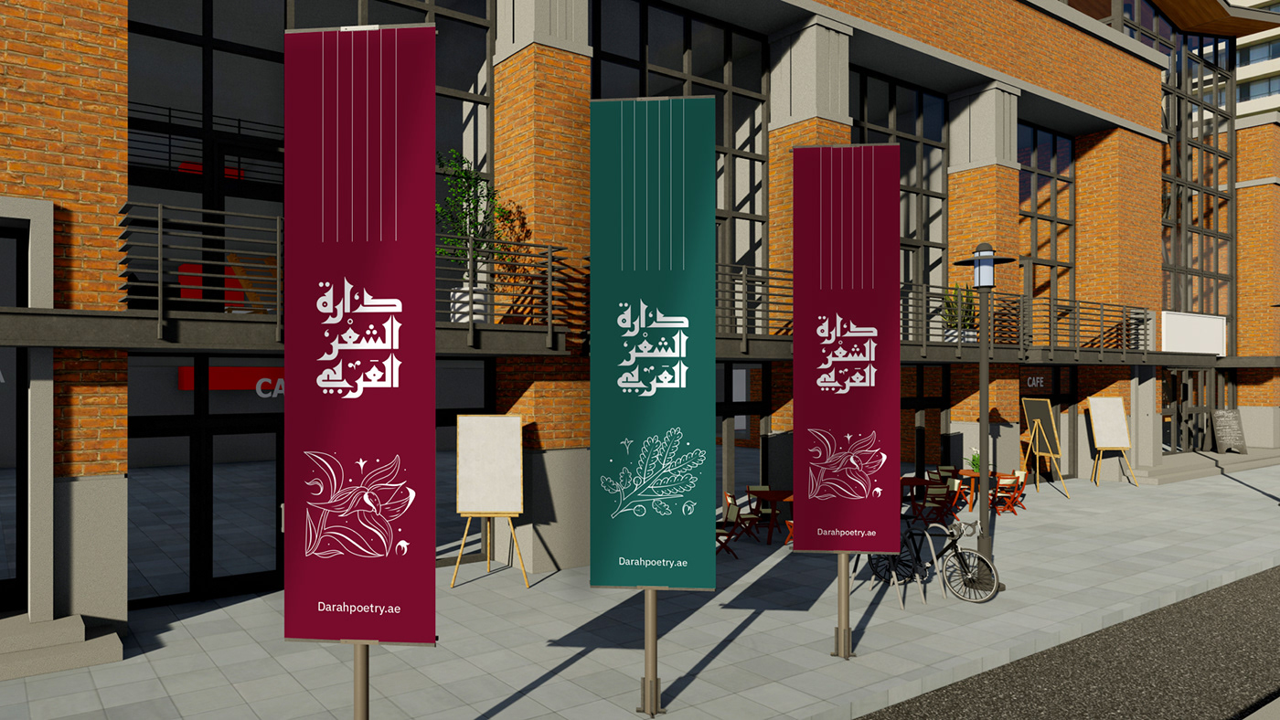
Choosing the colors for our logo was inspired by the orchid flower, which grows in Fujairah. The orchid is known for its stunning and vibrant colors, making it a symbol of beauty and elegance. The diverse and captivating hues of the orchid serve as a reflection of the rich and unique natural environment found in Fujairah. This choice not only connects the logo to the local flora but also brings a touch of natural beauty and sophistication to the overall design. The orchid's carefully selected colors convey a sense of vibrancy, freshness, and cultural richness, aligning perfectly with the essence and spirit of our brand.
A custom typeface has been designed for the Arab Poetry Foundation to reflect the essence of the brand by blending traditional Arabic calligraphy with a modern touch. The letters are crafted to carry the artistic legacy of both ancient and contemporary Arabic poetry, giving the brand a distinctive and unforgettable personality. This typeface complements the logo, providing a comprehensive visual language that speaks not only through the icon but also through textual representation.


The APF's font deeply reflects the center's identity, complementing the story that began with the design of a distinctive logo inspired by ancient Hijazi inscriptions. This font aims to have an impact beyond Arabic speakers, targeting a broader global audience. This step is a continuation, connecting the foundation with the world of poetry and various other artistic dimensions. The design of the Arabic Poetry Foundation's font letters was inspired by ancient manuscripts written in the Mus'hafi and Mashreqi Kufic script with a touch of modernity. A strong personality and flexibility characterize it. This approach allows us to offer options that blend geometric harmony, distinctiveness, and simplicity.


STUDIO: TSfonts Type Studio
ART DIRECTOR: Tarek Alsawwa
LOGO DESIGN: Shaymaa Hitou
CUSTOM TYPE DESIGN: Tarek Alsawwa
ILLUSTRATIONS: Hanan Baik
ART DIRECTOR: Tarek Alsawwa
LOGO DESIGN: Shaymaa Hitou
CUSTOM TYPE DESIGN: Tarek Alsawwa
ILLUSTRATIONS: Hanan Baik
MOTION DESIGN: Fatma Elsayed
GRAPHIC DESIGN: Mahran Dasouki
ORGANIZERS: Government Of Fujairah (UAE) | Saleemah Almazroui | Hajar Alraeisi
ORGANIZERS: Government Of Fujairah (UAE) | Saleemah Almazroui | Hajar Alraeisi


